Tag: vito delsante
#27 Black Cobra (3)

This one was probably one of the tougher ones to render since it this one is an actual existing character! The first and last two in the line of Black Cobras are all original ideas by me, and the middle three (#’s 3-5) are all public domain characters!
Concept: The Black Cobra/James “Jim†Hornsby – District Attorney/crimefighter.  Not sure if he’s related to #2 (may even BE #2), but if he is, he’d have to be #2‘s son. Jim and his younger brother, Bobby (#5), teamed up in the early days leading up to the US involvement in World War 2 to fight crime stateside. Jim was killed in action by Nazis on US soil.
Design: I didn’t really want to change his look from the original until I sat down with the design. The colors are horrid! So, I simplified it as much as possible (the hood isn’t quite the snake/cobra motif, but works). I wanted him to have the color black somewhere in the design, but couldn’t really figure it out, so I just made his pants black. Not proud of this one, but again, I wanted to keep him fairly recognizable.*
Late additions: Just for fun, I decided to do him less traditionally (ie, similar to the original) and more in tune with the “family” design I came up with.
The hood doesn’t attach to a cape. I just liked having something on his shoulders that made sense of the hood. I’m not opposed to a short cape, but I really didn’t intend for a cape to be attached at all. Sometimes a hood is…just a hood.
Art by Ricardo Venâncio!
Copyright © 2010, Vito Delsante.
#26 Black Cobra (2)
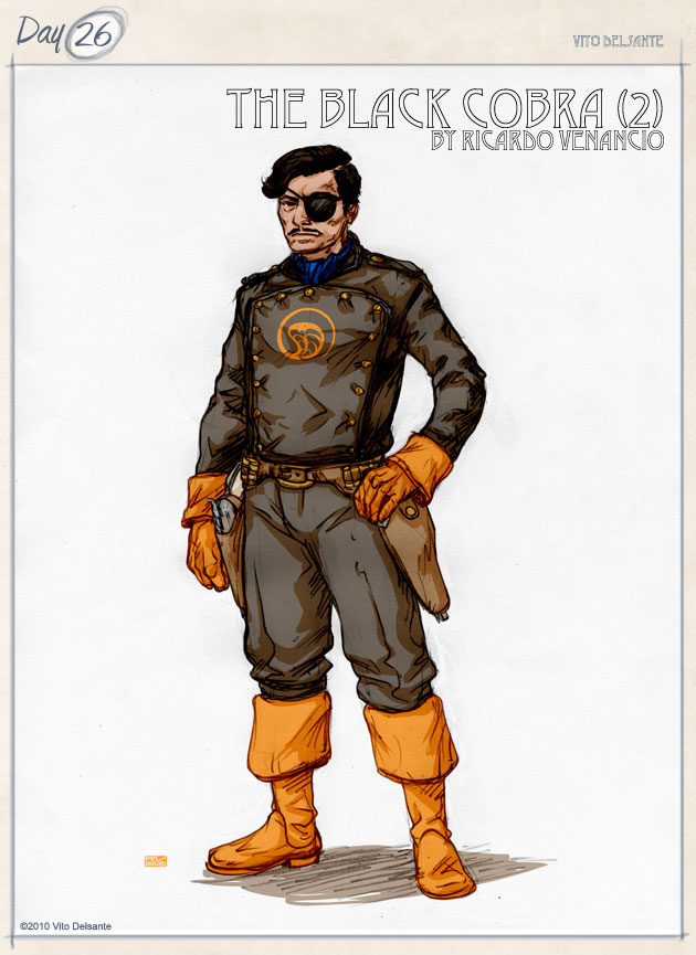
The second Black Cobra is the next in the legacy. He’s a bit of a question mark. No one really knows how he fits in.
Concept: The Black Cobra/? (Pulp) – The cowboy’s grandson (?).  He’s a true mystery and may or may not be related to any of this (like #4). He either inherited, acquired or stole #1’s revolvers. He is the biggest question mark in the entire legacy. As soon as he appeared, he disappeared.
Design: In my head, the eye patch and the mustache are both fake. Those are the same guns from #1 (Fang and Venom), so they would have the logo on the handles. This is the first Black Cobra to have the insignia/brand as a major part of the design. Note the pants…those will come back with Black Cobra #7.
Art by Ricardo Venancio!
Copyright © 2010, Vito Delsante.
#25 Black Cobra (1)
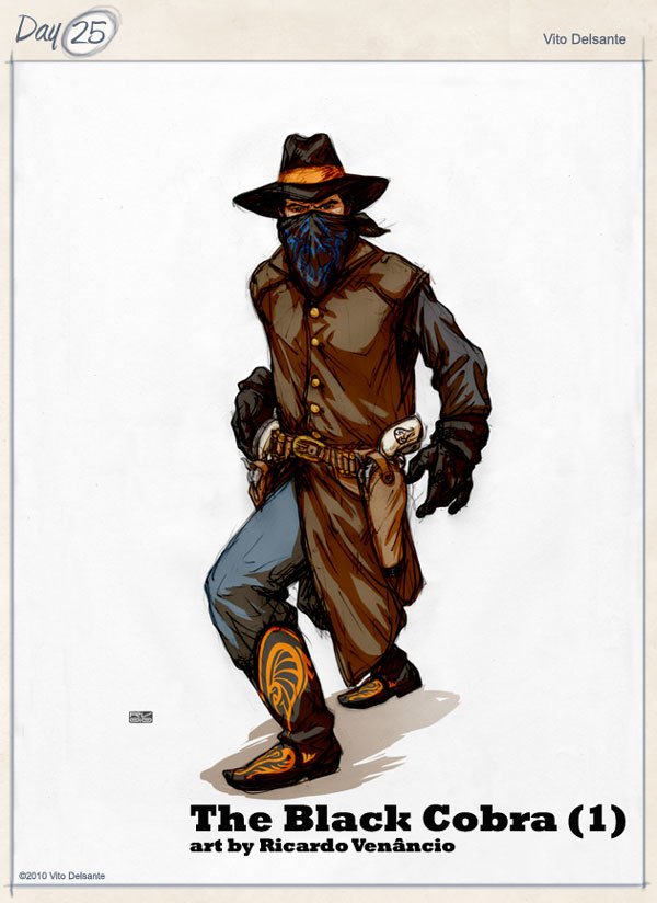
Didn’t plan on revealing these guys, mostly because I wasn’t so keen on the way they originally came out. But, to be perfectly honest, in trying to think up new characters, I kept coming back to the Black Cobra family (you’ll understand in the coming days). Up until now, these have been character descriptions in a document. Today, the characters come to life.
Concept: The Black Cobra/John Saunders (Cowboy) – An expatriate Brit who fought in the Indian Revolution and then moved to the US West to escape the Crown (the Royal British Army will be a thorn in his side) and became a gunslinger/lawman. His revolvers (called “Venom†and “Fangâ€) had black cobra design embossed in the handle.
Design: The cobra design is that circle to the right of his head. This character has ties to both Tex Leonis and King Snakeroot. The blue and orange colors will be a recurring motif as we go forward.
Art by Ricardo Venâncio!
Copyright © 2010, Vito Delsante.
#24 The Crusader
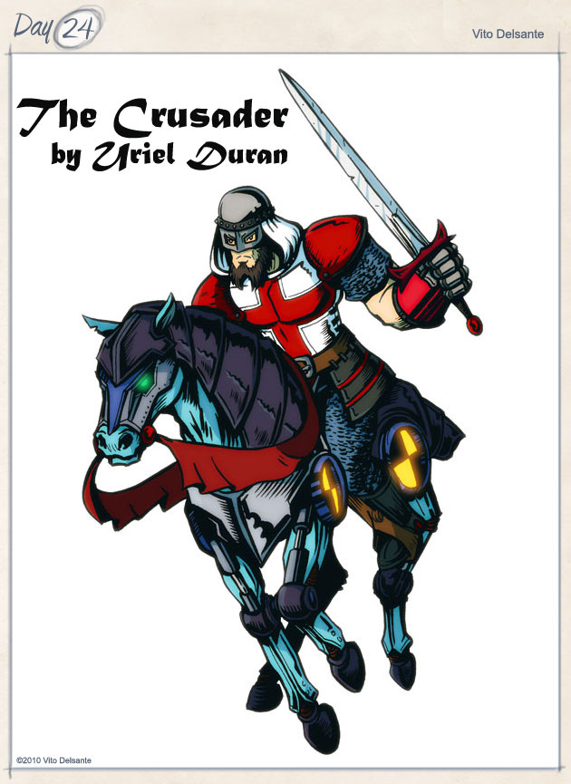
I really am not married to the name the Crusader, especially since his inspiration has nothing to do with the Crusades.
Concept: This character is based loosely on the legend of Saint George. You know, the Dragon Slayer. Anyway, I used to live in Staten Island, in an area called St. George. One day, I was walking to the Staten Island Ferry, and I saw a statue by a bus stop (near the library). I’m pretty sure it’s Saint George on a horse, but if it’s not, that’s what I saw. Then I looked toward the city, and saw the buildings, etc., and thought of “the Empire State.” New York, as if it were an evil empire (this was right around Election Day 2008, so you can see I was worried about a Republican presidency). Well, we need someone to rise up and fight the Empire, don’t we?
Design: There’s really only one thing wrong with this design. His colors should be white, not gray, to match the St. George Cross, so I’d fix the chestplate/armor to reflect that, but that’s the only change. And yes, this does take place in the near future, hence the robotic horse.
Art by Uriel Duran!
Copyright © 2010, Vito Delsante.
#23 The Cornerstone
Oh, time for a revelation. When I was starting out as a comics writer, I wasn’t getting many gigs. No one does, right? So, as a professional wrestling fan, and as a fledgling writer, I took to wrestling roleplaying. I will say this much for it; I had fun doing it. You can talk about it all you want, make fun, whatever, but I had a blast. And I’ll say this too; it taught me how to dialogue characters. If you can, try to find some of my roleplays online. I think they’re somewhere.
Anyway, today’s character(s)…
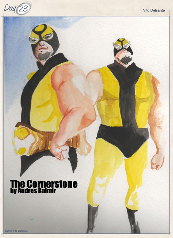
Concept: Where does a wrestler go when he’s hit the ceiling? After winning every championship (some multiple times), “The Cornerstone” Dino Black, the franchise of the federation, retires and goes into business for himself…as a hero for hire.
Design: The Cornerstone is based on me, but I wanted him to go a little bit further. He wears the black and gold of Pittsburgh, his hometown. The pants are supposed to be leather, but the leather that wrestlers wear (you know, pleather). The mask is new, but that just adds to his new heroic persona.
As an added bonus, I threw in his old tag team partner, Jack Suede! I picture him as a recurring character, helping him out when he calls.
Art (above) by Andres Balmir! Art (below) by Uriel Duran!
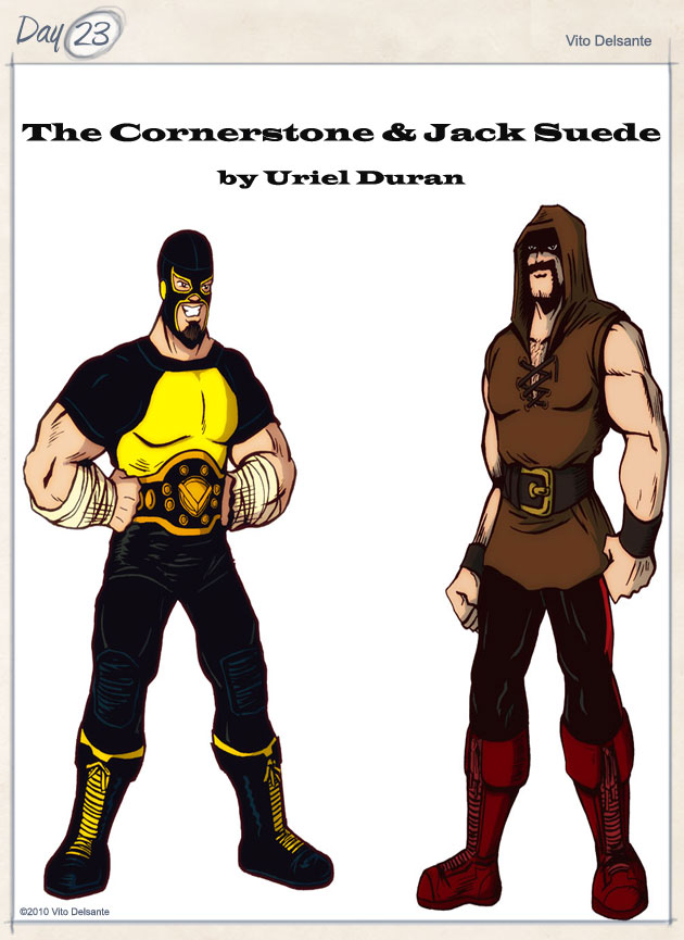
The Cornerstone is copyright © 2010, Vito Delsante. Jack Suede is copyright © 2010, Chris Schiavo.
#22 Dagar (the Desert Hawk)
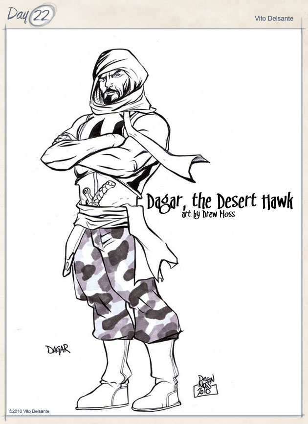
Yet another public domain character I’ve “RetroFixed.” I’ve been meaning to do this one for a while, but it took Gary’s Infidel to remind me that I had even considered doing this, so thanks, Gary!
Concept: I wanted to bring Dagar, the Desert Hawk into the new millennium, but with such a poor view of Muslims, I had to be very careful. The original character is stereotypical, especially in appearance, and I didn’t want that. I wanted to have a hero that could challenge reader’s thoughts about Muslims and the Middle East. I figured that since there’s not much out there about him, I could really add more. Dagar, to me, is Sayid from Lost; total bad ass. The thin line to tread though is…is Dagar a villain simply because of his difference in philosophy? And then I realized my solution: Dagar would be a field leader for Pax Mundi.
Design: The headpiece of the original was a little too…I don’t know if stereotypical is the word to use again, but it just seems a little racist. So, I wanted to keep it modern. Nevertheless, he had to have a dagger.
I might have thought too hard about this, but I like it. I hope everyone else digs it.
Art by Drew Moss!
Copyright © 2010, Vito Delsante.
#21 Air Force 1.0
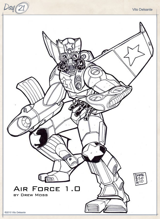
This one came to me while I was watching football on Sunday.
Concept: In the near future, terrorists have destroyed the President’s airplane, so the country’s best engineers put their heads together and create an exo-suit for the President. That’s right; the President is a superhero now.
Design: It’s red, white, blue and silver, which isn’t 100% US colors, but close enough. Took down the original design, but I with the new one (above), I like what Drew brought to the table. It looks less bulky and it could actually be worn. It looks closer to what I had originally intended, so it’s really a matter of great minds thinking alike.
Art by Drew Moss!
Copyright © 2010, Vito Delsante.
#20 King Snakeroot
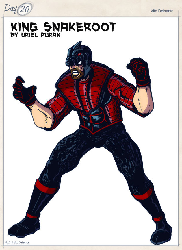
Oh, where to begin.
I have this idea to “RetroFix” this public domain character, the Black Cobra (there’s actually a few), ideas which may show up in the Challenge. I’m really excited about the potential for this character, so I’m trying to build up the supporting cast, especially the villains. Which is exactly where the King here falls.
Concept: The leader of the Cult of Naga, King Snakeroot has taken upon himself the task of exterminating the Black Cobra, a costumed hero with a long past. Rumor has it that Snakeroot has fought (and has been defeated by) every incarnation of the Black Cobra (a legacy that reaches back to the late 1800’s).
Design: Ugh. Not really. I like what I came up with, but that headdress is either too ostentatious or not ostentatious enough. I really wanted a snake crown, but not the Serpent Crown. Snake themes pop up a lot in comics, so it’s hard to be 100% original. I do like that his costume has segments, like a snake’s underbelly/abdomen. He has potential, and in the hands of a proper artist, I think he improves greatly. Screw all that! Uriel Duran nailed it!
Art by Uriel Duran!
Copyright © 2010, Vito Delsante.
#19 Tex Leonis
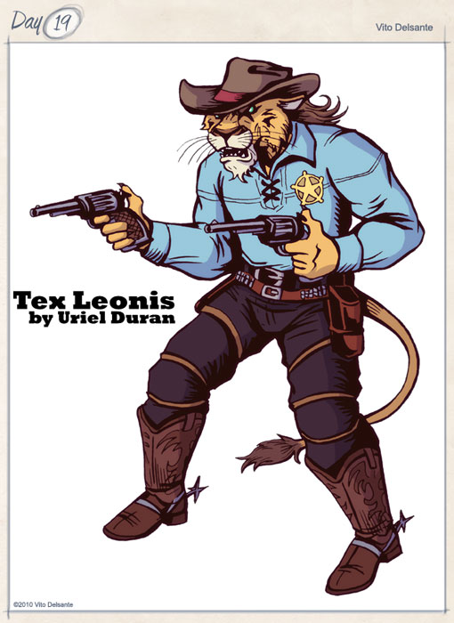
Another animal humanoid hybrid. I was watching The Good, The Bad and The Ugly a few days ago, when, for some reason, inexplicably, this is what my mind wanted to see; a cowboy lion (or, a “clion” as my wife likes to call him).
Concept: Tex, a feline humanoid, “fell to Earth” in the 1800’s in the West, where he was raised by a Native American tribe. When he came of age, he set out to right wrongs, and joined the “white man’s world.” After a lot of gun duels and dealing with prejudice, he was eventually accepted and named Sheriff of Kappa City where he came across the outlaw hero, the Black Cobra.
Design: Other than the exclusion of a sheriff’s star, do you need any more explanation than this pic?
Art by Uriel Duran!
Copyright © 2010, Vito Delsante.
#18 Celestina
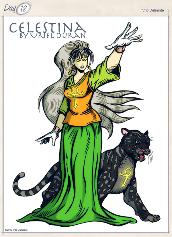
Another Michelle/Vito collab.
Concept: Celestina is the embodiment of the galaxy. She’s similar to the pagan goddess, Sinthgunt, or the Marvel Comics character, Eternity. In my head, her role is performed similarly to Roma; in other words, she intervenes when the universe itself is in danger.
Design: All Michelle. So, I asked her, “What were you thinking?” Her answer:
“I don’t remember.”
Love that girl.
Anyway, she did say that the jaguar/panther (not sure what it is) is her familiar.
Art by Uriel Duran!
Copyright © 2010, Michelle/Vito Delsante.
#17 Tuo (the Alligator Man)
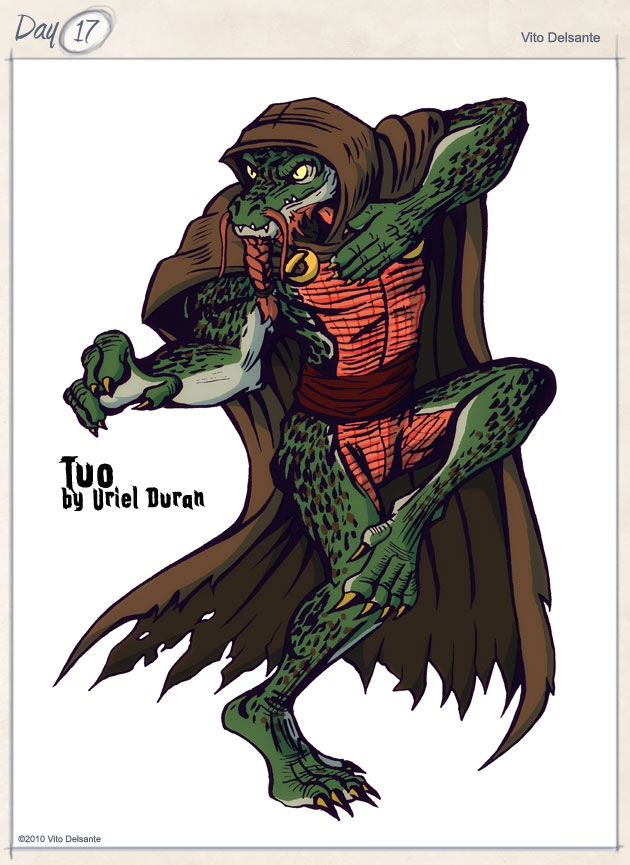
I love reptiles. Always have. So, I wanted to make an alligator man (similar thinking led to my #19 entry, which you’ll see). The idea was to create a character for my upcoming webcomic, The Aquarian 7. Not sure if Tuo here will make the team or be a villain, but he will show up at some point.
Concept: Tuo is a mutated Chinese alligator that was discovered along Yangtze River. He was taken to a Shaolin temple in the Shanxi Province, where he was trained in the martial arts. He is very protective of his people, and his presence has become an urban legend.
Design: I toyed with the idea of making him either a mutated human or an alien (hence the beard). The hood/cape adds to the idea of the urban legend aspect. There’s a lot to be learned about him, but, design-wise, he’s all there.
Art by Uriel Duran!
By the way, he’s named Tuo for the Chinese character that represents the alligator. Not sure if that’s Mandarin or Cantonese.
Copyright © 2010, Vito Delsante.
#16 Ladyhawke
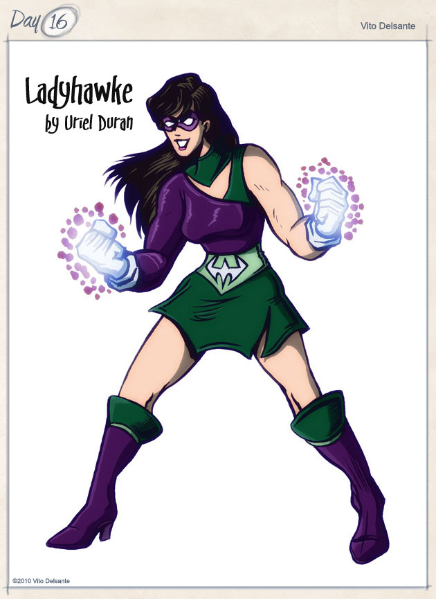
This is another Michelle Delsante co-creation, but I like where she went with the design (created, almost, immediately after I did Spacehawk). She did the design, I came up with the name and character background. Who says marriage is like creating comics? Me, that’s who!
Concept: Ladyhawke (Lizzy Scott) was a superhero in her own right (formerly known as #4, from the Siren 6), defending the innocent and fighting evil on the streets of Boston. And then she met Spacehawk. A (literal) whirlwind romance ensued and the two married. Ladyhawke changed her costume to match that of her husband’s. And even though they spend most of their time apart (due to his condition), their marriage is as strong as ever.
Design: I should really ask Michelle what she was thinking with the design, since it was her idea, but I can tell that it’s a feminine version of Spacehawk. She doesn’t have any powers (except for her gauntlet/gloves, which doubles the kinetic energy of her punches). Her outfit is made of an alien chain-mail that absorbs energy.
Art by Uriel Duran!
Copyright © 2010, Vito Delsante/Michelle Delsante.
#15 Xenos
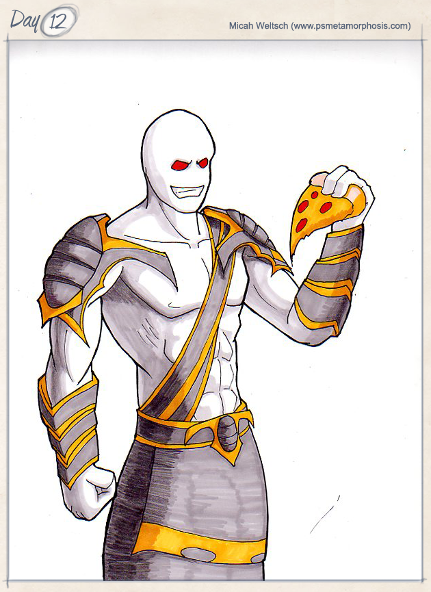
Halfway point.
Here’s another old one that is seeing the light of day after 11-12 years. I created this guy when I was living in Seattle, and I actually drew him up…I just couldn’t find the drawing. Fail.
Concept: Xenos is an alien that was sent here to destroy the Earth (yeah, yeah, Invincible and Omni Man, but I assure you…I created his guy in 1999). But he fell in love with our culture…specifically, our food. He’s a shapeshifter, which enables him to experience life on Earth as anyone…which means he can eat anywhere.
Design: Gave him no color and no distinguishing marks because he shapeshifts. His costume has an Egyptian feel to it, as his culture, on his native planet, was very influenced by Egypt (again, it sounds like I took that from Hawkman, but once more…1999).
I realize how cartoony this looks, but the original drawing that I did in ’99 used a Bruce Timm animated template, so when I put this together, I wanted to try to make him look as close to my original drawing as possible. He’s not necessarily supposed to be rendered like this, but it helped me to see it better.
EDIT: Fellow 30 CC Challenger, Micah Weltsch, drew up a version. Love it! See above!
Copyright © 2010, Vito Delsante.
#14 Spacehawk
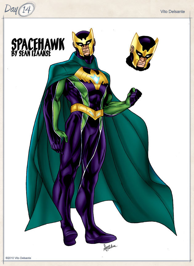
This one came from a desire to do a Superman archtype, but somehow, turned into a RetroFix of a Public Domain character (named, Spacehawk, who was created by Basil Wolverton). This is probably the most I’m going to write about any of the characters I’m submitting for the Challenge, so bear with me.
Concept: When I found out that Spacehawk (the name) was taken, I wanted to see what the character was all about, so I did my research, and found that the original Spacehawk was a futuristic character that, to keep up with the times, was put into the War and fought Hitler, etc. The book was cancelled soon after (or, at least, his feature). And that’s when my concept came up…
Spacehawk was from an alien humanoid planet and came to our world to protect us from alien threats. He helped in the Allies war effort among other heroes of the day, but shortly after the Atomic Bomb was dropped, he disappeared into the heavens. As more atomic (and then nuclear) weapons were tested, Spacehawk found that the Earth itself was poisoned. He could no longer touch the ground for fear of dying (his alien physiology was susceptible to such radiation). He has returned, but as long as the Earth continues to destroy itself, he may never come back fully. He hovers and flies everywhere on Earth, and even has an Earthbound wife (Ladyhawke, see Character #16), but if he ever sets foot on the ground, his body will begin to deteriorate at a rapid rate.
(By the way, I couldn’t find any indication of powers, so I just took liberties.)
Design: When I started putting together my Superman, I wanted a cape. The belt and helmet look sufficiently alien, as does the logo. Love the colors (Michelle’s suggestions). When I saw the original, I realized mine looked nothing like Wolverton’s. Just for fun, I did a mockup of the original (see below).
Art by Sean Izaakse!
Copyright © 2010, Vito Delsante.
#13 Party Girl, PI
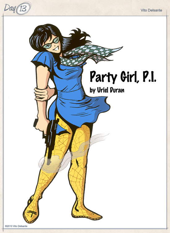
Another old one gets reworked and hits the light of day after 14 years of sitting in a drawer.
Concept: Many moons ago, I used to hit bars, mostly to see my friend’s bands play. And somewhere, there was always the hippest of hipster girls, looking too smart for her own good, that was both stylish and sexy. I always wondered what these party girls would do for work, and in the back of my mind, I thought, “Wouldn’t it be great if she was a detective?” Well, two things happened around the same time: I saw the movie, Party Girl, with Parker Posey, on tape and the Michael Alig/Angel Melendez murder. The latter hit home because Angel’s body was found around the area I was living in. So, I really thought about how my Party Girl, PI would solve his murder.
Design: It’s all pretty much in the concept. Chelle Parker, aka Party Girl, PI just needs to be stylish, hip, and sexy. The glasses are for work mode. She has to look like she is hitting the club immediately after doing some fact checking. She’s Modesty Blaise or Dakota North with a bar tab. A heavy bar tab.
Art by Uriel Duran!
Copyright © 2010, Vito Delsante.
#12 Black Terror
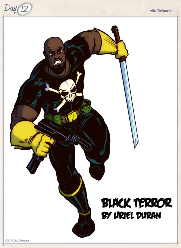
Public domain character time. Seeing Greg Giordano do a few PD characters got me antsy for doing one, so I killed two birds (PD and a color titled character) with one stone. And this is a doozy.
Concept: Growing up, there were tons of characters called “Black __” that were African American (in some cases, African). So, when I discovered the public domain characters, and the Black Terror, I decided to go all out and create an original BT. This one owes much of his existence to the Blaxploitation flix of the 70’s. The idea: The Black Panthers created their own killing machine, called, “The Black Terror,” that they unleashed on racists, neo-Nazis, and the like.
Design: Uh…it’s pretty much the Black Terror with some minor fixes. No cape…for that matter, no pirate theme, other than his t-shirt. I toyed with a skull mask or make-up in the shape of a skull, but that was too distracting. Keeping it simple, keeping it recognizable, and keeping it real were the most important factors going into this reimagining of a familiar character. Could probably add some more weapons, but I don’t want him to look like the Punisher, because that could easily happen.
Art by Uriel Duran!
Copyright © 2010, Vito Delsante.
#11 Lady Deathshot
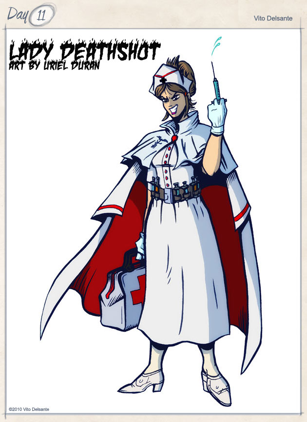
I take no responsibility for this, but I love the way it came out.
Michelle, my wife, is a nurse. Has been for a long time. So, when I started the Challenge, I would draw out basic sketches, trying to just get the jist of my characters on paper. Michelle, since we’ve been together, has become a huge comic fan (mostly of Batgirl) and I guess she saw me sketching and decided to sketch out Lady Deathshot (see below). When I started using Hero Machine, she jumped on and rendered LD. And did a bang up job, if I say so myself. Very proud of my wife, who has become a co-creator with the publishing of this character.
Concept: Elle Driver from Kill Bill without the ninja training meets Dr. Killinger from the Venture Bros. Lady Deathshot (Victoria Frost) is a nurse who works on the side of the devils. She’s out to maim, kill, and destroy, not heal.
Design: The killer Florence Nightingale. She has syringes full of different poisons and a bag full of bad intentions
Seriously, I’m so impressed with my wife, it’s ridiculous.
New Art by Uriel Duran!
Copyright © 2010, Vito Delsante/Michelle Delsante.
#10 Jonas “Jonesy” Jones
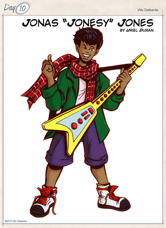
Oh, I love it when a joke creates an actual good character. Jonesy here was a joke between Michelle and me, about how dumb the name Jonesy Jones would sound. And then I decided to make him a time traveller.
Concept: Jonesy Jones is supposed to be a mix of Tom Swift meets Dr. Who. I’ve been toying with a costume idea for Halloween for an American Dr. Who (I keep calling him the 15th Doctor), and for some reason, I didn’t want to lose the design, so I put it on a kid.
Jonas Jones’ favorite game is Rock Guitar, and he’s very good at it. While playing a song on Expert, Jonesy hits a chord that creates a vibration so intense, it sends him back in time. When he wakes up, he finds himself at Electric Lady Studios…in 1969. Jonesy is jamming with Jimi Hendrix. He hits the chord backwards, and he goes back to his time. Jonesy comes up with a plan: travel back in time to record his jam sessions with some of the biggest names in music and bring it back the recordings.
Design: Just a kid (12 years old or so) with a fake guitar/guitar controller. You could put just about anything on him and it would work. Since doing the Phantom Shadow, I’m in love with the scarf as accessory (I have at least one more character this week with one). Overall, I like the way this came out. I was going to make him bald, but he kept looking like Little Bill.
Art by Uriel Duran!
Copyright © 2010, Vito Delsante.
#9 Mr. Sunday
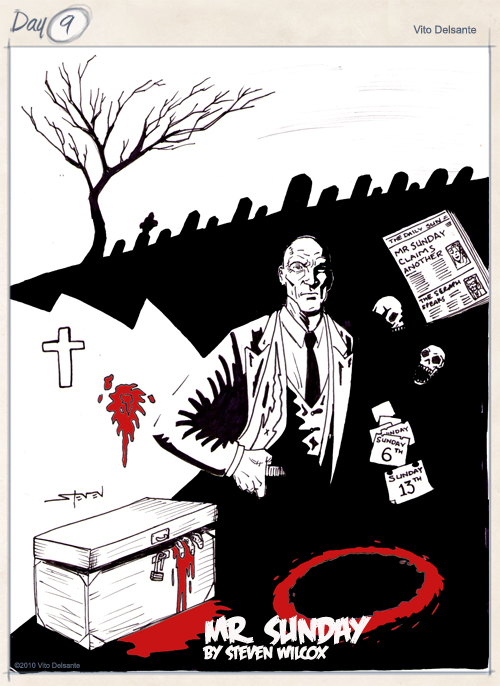
Now with new art!
Concept: Mr. Sunday is a serial killer. He’s been at it a long time (he’s about 60-70 years old and still going strong). His method: He kills every Sunday, during church hours (pardon the pun, but he’s a “mass” murderer). He’s kind of set up, ostensibly, to be a recurring villain for The Seraph, but in reality, he’s just a huge ball of evil that is always in the back of everyone’s minds.
Design: First, he’s supposed to be old. The best I could do was skinny. The clothes aren’t entirely correct either, but close. He should stand about 5′ 3″, if you consider the fact that he’s hunched over. Also, his mouth is just supposed to be wrinkles, but I think the closest I could get was a zombies (chewed off) mouth. Not enough wrinkles, too tall, too built. But that circle he’s standing in…it’s just supposed to allude to some of the more sinister aspects of his killing methods (and yes, it’s made of blood).
EDIT – Image replaced with artwork by Steven Wilcox!
Copyright © 2010, Vito Delsante.
#8 The Seraph
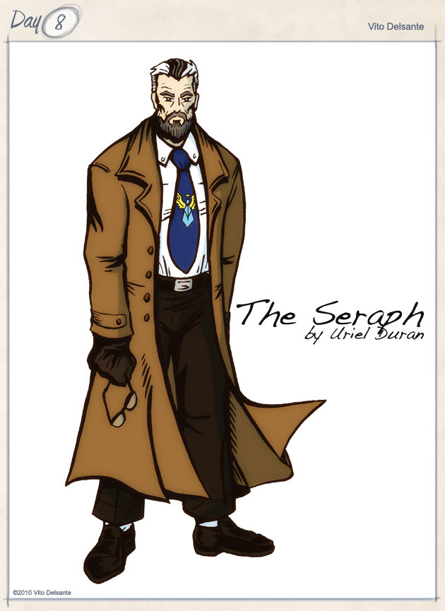
Yet another old character of mine that is finally seeing the light of day. This one, until now, existed as a name on a piece of paper proving once again that no idea dies if you’re a hoarder of paper (and as a comic reader/creator, I am totally a paper hoarder).
Concept: The Saint meets The Equalizer. Former USMC, Vietnam vet (aged in real time, he’d be in his late 50’s/early 60’s) employed by the church to help anyone whose problems can’t be solved by prayer. Now, this is the unique angle; his employers are every church in town. Christian, Jew, Muslim, Hindu, Buddhist…all of them. He is non-denominational, and may, in fact, be agnostic, in order to best serve the folks he’s hired to help.
Design: There’s not much to this. Suit, tie, typical detective stuff. The only real distinguishing characteristics are his hair color (a Bob Ross happy accident if ever there was one) and his tie pin.
EDIT – I finally remembered his alter ego! It’s Grant Mason (a play on Simon TEMPLAR, get it?)
Art by Uriel Duran!
Copyright © 2010, Vito Delsante
#7 The Viceroy
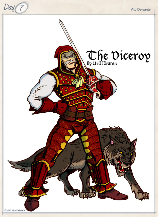
Super villain time. I was having brunch with my wife and friend on Halloween and we went to our usual spot: The Viceroy on 18th Street & 8th Ave here in NYC. While there, I wondered what a viceroy was and when I looked it up, I found the makings of what I hope will be a great villain.
Concept: A viceroy is a high ranking official that governs in the king’s place. This one (Miguel Morales-Rojo), however, has no king and the power has gone to his head. He isn’t time displaced…just a little crazy (think an evil Don Quixote crossed with the Batman rogue, the Cavalier). I envision him having a ship that is part scooner, part TARDIS (that should spark your imagination).
Design: I knew I wanted someone that had a regal look, and that piece reminded me of the Spanish Armada, which was also the thinking behind the colors. The character is modern, but I wanted the character to have an air of “privateer” about him. Those pants are killer. And the wolf also seems appropriate for some reason. You can’t tell, but he has gray hair under that hood.
A week’s worth of characters in the can. Let’s see if I can keep that pace.
Art by Uriel Duran!
Copyright © 2010, Vito Delsante.
#6 Pax Mundi
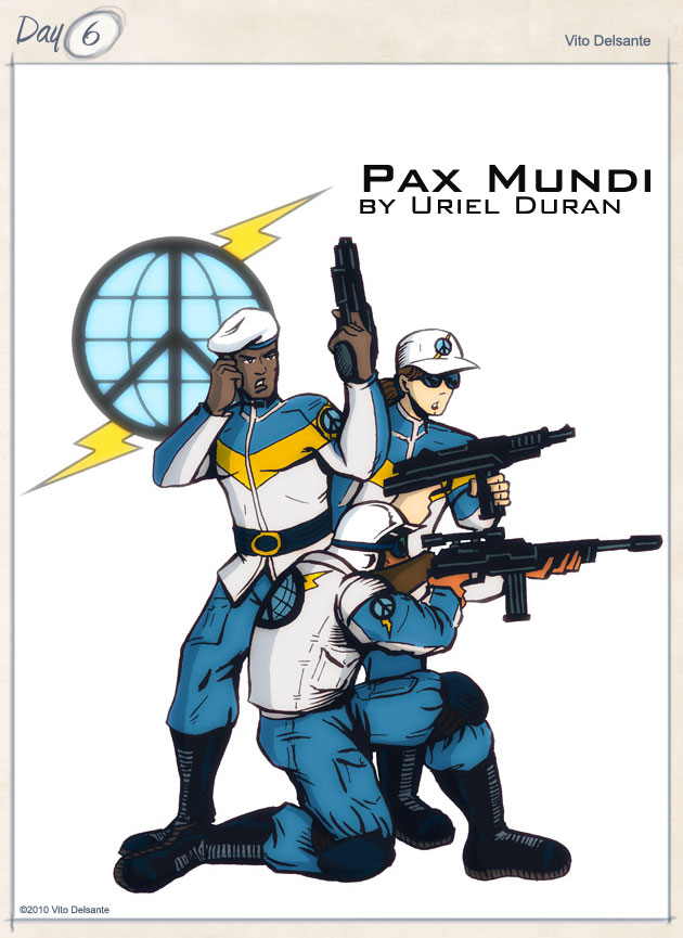
I’m going to go ahead and post my sixth (!) entry a day early because I have KingCon tomorrow (thank God for Hero Machine). If you’re around the Brooklyn/NYC area, please come out! I have a panel at 12:30 PM called “Collaboration Counseling” with a host of guests. Should be fun!
Ok, here’s my attempt at creating a team.
Concept: The idea here is a group that is so dedicated to peace, they are ready (and more than willing) to cross the line. Think of the small American militias but on a global scale. But these aren’t just religious zealots or NRA enthusiasts… Pax Mundi is a group comprised of many nations, beliefs and people from all walks of life. The difference between them and us is they are killers with a righteous cause. I’ll be honest, I don’t know if they’re heroes or villains. It would really depend on who they were fighting. If this were Dungeons and Dragons, they’d be “chaotic good” with the exception of being disorganized. They exist purely for the sake of world peace and creating Utopia.
Design: The two colors that dominate their uniforms are white and a light blue (powder or baby are good hues). They are comprised of different “jobs,” like GI Joe, different specialties. You have a paramilitary branch, an administrative branch (political lobbyists, etc), and, to put it bluntly, the average Joe that signs up because he/she believes in the cause.
Art by Uriel Duran!
I’d probably add an Earth logo with a peace symbol super-imposed over it (similar to this) with a lightning bolt behind it as their logo.
Copyright © 2010, Vito Delsante.
#5 War-Maker
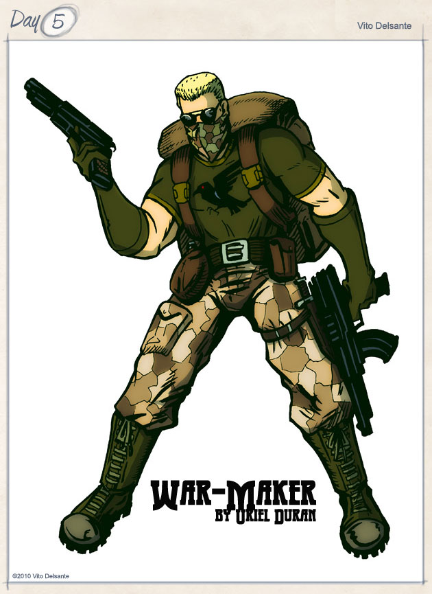
This is another retooling (I’ll probably have a few of these) of a past project. This one, however, didn’t start as a creator owned project, but a pitch for DC Comics’ Peacemaker.
Concept: WM is to war what DC’s Major Disaster is to chaos (the two are almost synonymous). WM can, with ease, sow discord among any two people, whether they disagree on something or not. For instance, he knows exactly what to say to break to people up, but further than that, he knows exactly where to place a pebble that can cause an international incident. He can create conflict from a personal to galactic level.
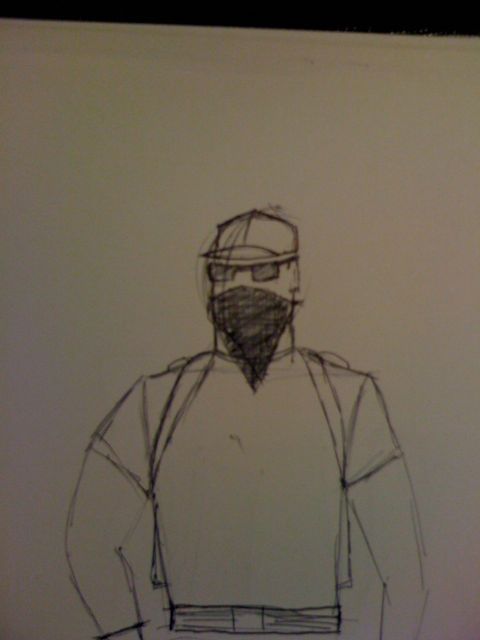
Design: The first thing I wanted was a symbol, one that would contrast the Peacemaker’s dove. WM has a crow/raven, a bird that is associated with war in Celtic, Native American, and to a small degree, Norse myths. I like the idea of a t-shirt (which lends itself to branding) as his costume. The rest is modern military, even the bandanna. I can’t remember who said it, but someone brought up the fact that while WW2 inspired the creation of many heroes, the Gulf Wars didn’t. I see WM as a vet of both Gulf Wars, and as a companion to the character I created with Dean Trippe, the Red Cross.
So, as you can see, I did an initial drawing that…has elements I wanted to represent (the bandanna, the backpack), but my abilities, as limited as they are, just couldn’t swing it.
Art by Uriel Duran!
Copyright © 2010, Vito Delsante.
#4 The Phantom Shadow
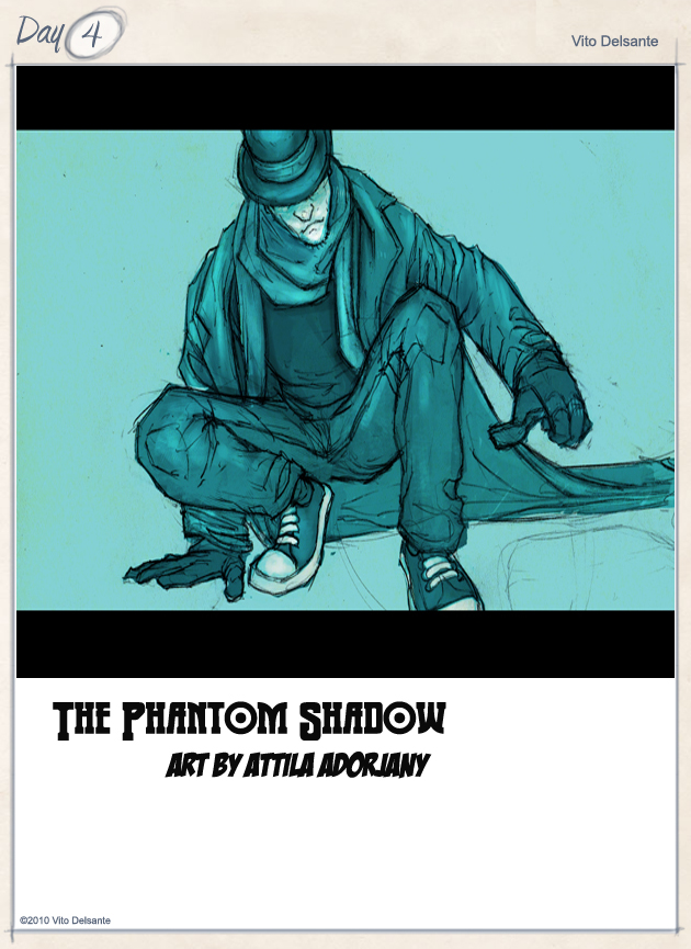
Yeah, this one is silly. But probably no sillier than anything else I’ve come up with as an inside joke.
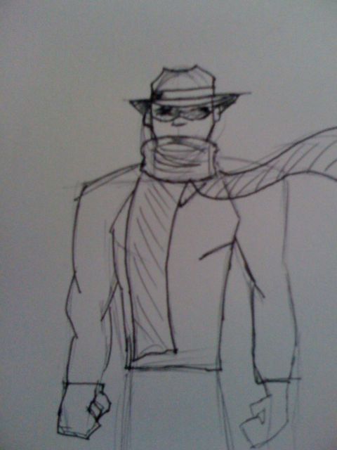
This idea came from looking at one of the back issue cases at Jim Hanley’s Universe and seeing an issue of The Phantom next to an issue of The Shadow and blurring the words together.
Concept: While I’d love to do this as a straight pulp from the 30’s and set it then, I really want to push the expectations of pulp, and set it today, like Brubaker & Phillips’ Incognito.
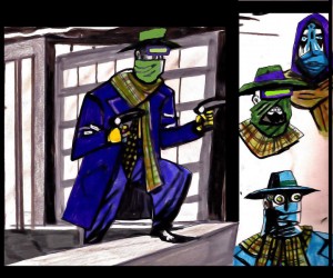
Design: I’m going to keep some pulp tropes; the hat, the mask, and, like his namesake, a scarf, but what we’re looking at…what my intent is…is a hipster as a pulp hero. Tight v-neck sweater, black jeans, Converse All-Stars, black leather gloves and a fedora. Domino mask combined with the shadow of his hat combine to obscure his eyes entirely. The scarf is an odd-ball element. I wanted something that emulated a cape, but had that element of pulp mystery. I like the idea of his sweater and scarf being somewhat malleable after a fashion. What I mean is, the sweater won’t always be black, but gray, navy, crimson or forest green…dark colors. Likewise, the scarf will always be dark, but could have patterns. Theoretically, I’m pushing the idea of shape as costume, where his silhouette would play a role as identifier.
Note: My limitations as an artist are really starting to come to the surface. This one took four tries before I saw the character in what I was drawing, and I’m still not 100% happy with it. Furthermore, he should be wearing a black raincoat (not a trenchcoat), but again, I have limits to what my pen can represent on a page.
EDIT: Now with art by my bud, Attila Adorjany! See above!
EDIT 2: Check out Danny Kelly‘s version!:
Copyright © 2010, Vito Delsante.
#3 The Black Fist
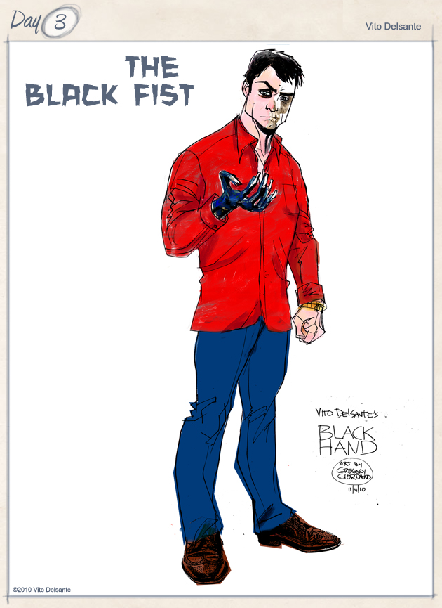 One of the preexisting conditions I put on myself for the Challenge was, “Minimize the number of characters with colors in their names.” I could put the same condition on animal names, but I’m sure I’ll need a crutch by Entry 17. At this rate, I’m predicting at least four characters with colors in their names, but let’s not jump ahead…
Black Fist is a re-imagining of a character I created waaay back in 1999 for, if I’m not mistaken, one of the first prototypes of what would be called, “webcomics.” We can argue this at a later date…
Concept: Xavier Exley is the world’s biggest movie star. A multiple award winner, the most sought after actor in the world, and cover boy of a dozen different magazines a week. He influences studios, heads of state, and millions of fans internationally. Think Brad Pitt or George Clooney. If he wanted to, he could probably propagate world peace, but he’s more concerned with world pieces.
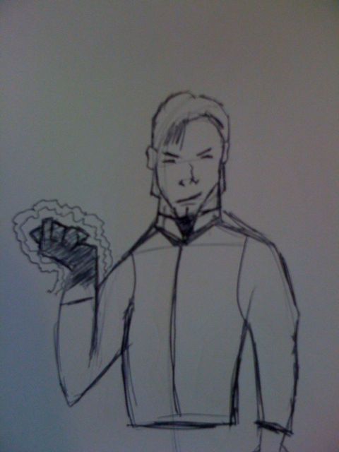
Design: This is a lay-up. The best looking movie star in history. With one (fatal) flaw. Exley’s right hand is, by all appearances, dead, with a sort of necrosis that covers his entire hand. It is also the source of his power. Exley’s touch saps life energy at a slow rate, but if he punches you, he absorbs that energy at a greater rate. Don’t fight the Black Fist; you will die!
By the way, that’s not a goatee/beard on his chin…it’s a necktie that’s under his vest (or as Tony Lee would say, “waistcoat.”)
EDIT: Fellow 30 Characters Challenger, Greg Giordano (aka flameape), did the awesome Darwyn-esque version of Black Fist you see above. He misnamed it, but I think we all know what he meant. Thanks, Greg! Check out his entries in the Challenge here!
Copyright © 2010, Vito Delsante.
#2 Propella
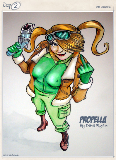
Propella

If you laughed at the last drawing, wait until you see me draw women!
This one is really my wife’s brainchild. See, Michelle has this character in name, but never really fleshed it out. So, she begged me to bring her to life in the Challenge. This one’s for you, “Angel Food Face!”
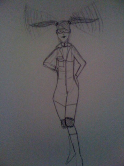
Concept: Renee Santos is a typical teenager with a special talent; using telepathy, she can compel her hair to spin so fast, it enables her to fly.
Design: She’s a teen, so I wanted to avoid the greatest problem plaguing teen heroines; looking too sexy for their age. Think this is easy? Google “helicopter pilot” images and notice the two girls in their underwear.
As I just mentioned, I put Propella in a helicopter uniform, but made one adjustment, and cut the legs off, making them shorts. Superhero boots and knee guards (in case a pigeon flies into her, I guess) protect her lower half. I didn’t want to draw too much, since my art is awful, but she should be wearing a flight vest, or something visually similar as I’m thinking this would protect her vitals. Also wanted to put her in an old fighter pilot’s cap…the one that looks like a leather football helmet, but that might take away from the visual effect of her hair. Oh, and she’s intentionally small breasted to emphasize her age.
EDIT: Now with art by Dave Ryan!
Copyright © 2010, Vito Delsante.
#1 Gorilla Ghost
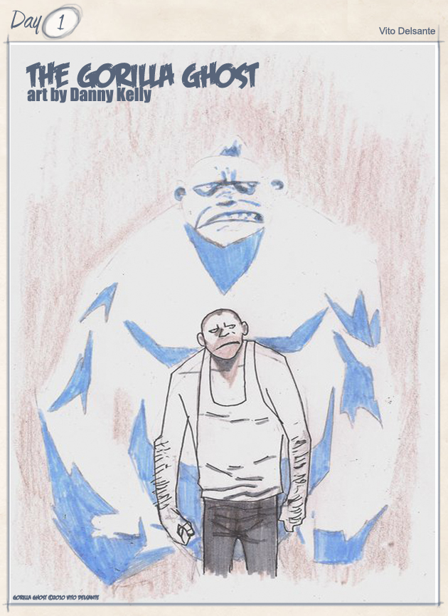
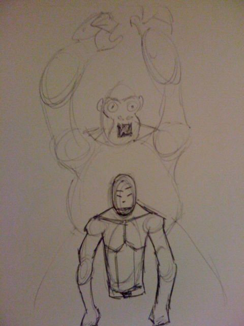
I have to cop to getting this one from watching The League on FX. They kept saying, “ghost monkey,” and it stuck in my head. Hence, the Gorilla Ghost.
Quick run-down: Carl Rundy is our character’s name, and he’s possessed by the ghost of a recently deceased gorilla. Haven’t decided on hero or villain, but that might come organically from the design.
Design: The idea of a gorilla ghost is absurdly Silver Age, but that just means it’s fun. I see GG as being mostly human looking, so Carl is the focus of the design. He’s hunched over, with knuckles dragging and calloused over due to walking on them. He’s in varying stages of undress, due to the perceived uncomfortability that a gorilla would have wearing a man’s clothes. The other, major part of the design is the ghostly avatar of the gorilla that echoes his pose. The gorilla can’t be seen by anyone, save mystics, but he’s always there, influencing Carl’s every thought and movement. Carl doesn’t get any benefits from the possession, like gorilla strength or the ability to climb or anything…he’s just stuck with the ghost. Poor Carl!
By the way, I can’t draw at all, so you’re all going to have to deal with sketches like this for 30 days, so 😛 thhpppppt!
(PS – I’m doing these almost exclusively on my iPhone, so I will reformat the images at a later date)
EDIT: Artist, Danny Kelly, took a swing at GG! See above!
Copyright © 2010, Vito Delsante.





#30Characters Chatter…