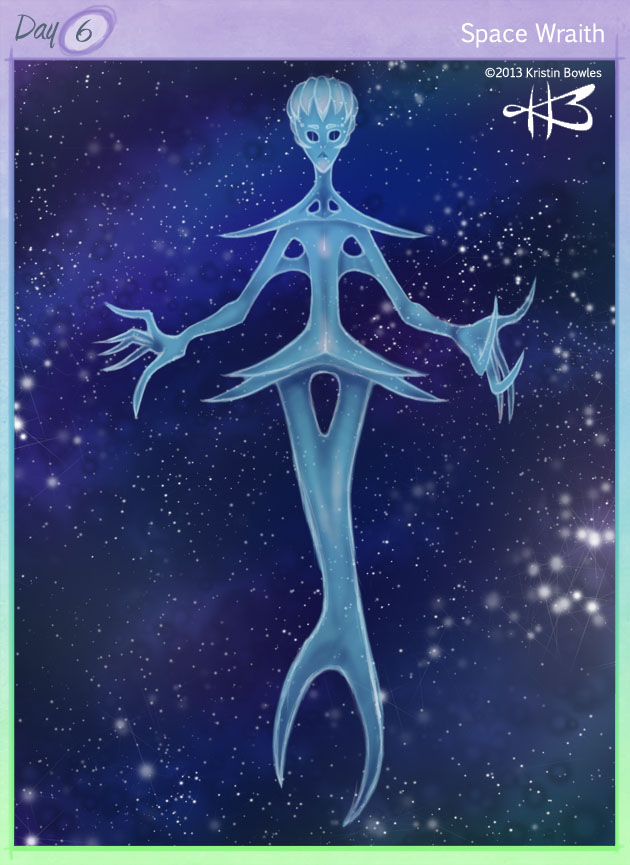
06: Space Wraith
Character Name:Â
Space Wraith
Brief Bio/Description:
The space wraith is not, in fact, a ghost. It is a living creature that floats throughout the vacuum of space. The method of reproduction is unknown. They have been observed hurtling through space, with unchecked momentum, and bursting into tiny gelatinous blobs upon impact with space debris. Each bit of the space wraith’s flesh will independently develop its own primitive appendages, until it consumes enough organic space dust to grow, or until it manages to reconnect with other small space wraith flesh bits. Due to their ability to split and merge, they exist in a great range of sizes – from mere molecules to the size of a gas giant. The most common size is between ten and twenty meters in length. While they look menacing, most space wraiths are material scavengers and do not actually consume meats or many plants. Recorded encounters between space wraiths and humans have been remarkably uneventful and boring.
Style Commentary:
Honestly, I got really wrapped up in that persistent Galactic Overseer idea again. Today, though, I realized my image for it is too humanized for me to be happy drawing it right now. But now that I’ve settled on that, I was perfectly comfortable doing another space alien thing! I had a great deal of fun with the background (found myself a new, gargantuan pack of really neat Photoshop brushes) and worked the character on top of it. First I blocked in a shape/rough silhouette, to shake things up. Then I roughed in a white pencil sketch on top of and around the silhouette to fill in details and help refine and define the creature’s body. Once I had a good visual and solid mental image, I laid down a clean black pencil line layer, scrapped the silhouette and white pencils, and made a new base color layer within the confines of the clean lines. I decided at that point that I wanted the creature to be slightly transparent. I worked at 100% fill and used a single clipping mask, and once I was done, brought everything down to 67% and got exactly the result I was looking for!
05: Grindelia
Character Name:Â
Grindelia
Brief Bio/Description:
Grindelia is a spitfire lion-dragon. She’s also very flirty, and doesn’t care about what race or gender – or lack thereof – you are. What matters to her, is character depth and interest. And intelligence. Like her great-aunt, the Sphinx, Grindelia loves riddles. She also loves deep philosophical discussions and ponders the great expanse of the universe on a daily basis. Her favorite beverage is orange-banana smoothies, and her favorite food is cream-cheese-iced brownies. She is so fond of the brownies, especially, that she has been known to forgive even the most extreme of grudges with a batch or two offered up in apology. She cannot fly, and envies her dragon-kin who can. Though few have hair as luxurious as hers, so she seeks solace in that fact and is known to be at least a little vain. On that note, she is sometimes plagued by worries about her appearance.
Style Commentary:
After seeing saulone’s great monochrome pieces, I wanted to stray away from color today and work with value and contrast. I also wanted to keep away from the aliens that have plagued my imagination lately, and also stay away from a humanoid character – so I got an idea for a dragon-like creature and went with it. I let my lines flow and grow on their own. Grindelia evolved organically from a roughed-in head shape, which grew a wandering neck, which perched atop almost-crossed arms, with a large hump of a rump behind her and a snaking tail to allude to her playfulness. I have not yet mastered the use of mid-tone backgrounds (I’ve got years of working on white paper with dark graphite) but I think this was a hugely successful attempt! If you have any suggestions or tips for working both additively and subtractively on a midtone background without going too crazy on either the highlights or shadows, I’d love to hear them!
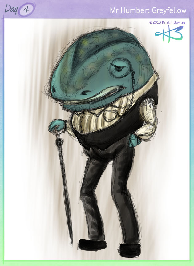
04: Humbert
Character Name:Â
Mr. Humbert Greyfellow
Brief Bio/Description:
Humbert is a self-made man – well, whale-man. He had a knack for business and made his first small fortune by giving the people in his town what they wanted and needed, for a competitive price. Which, at the time, was the news. He worked out the best possible routes to serve the most people in the shortest amount of time and was able to fill more orders on his own than several other postal veterans could with their combined efforts. His mind for mechanics and logistics took him through several local businesses, until he started his own, in furniture. And protection. He doesn’t like to be called the Boss. And his kindness is genuine. But, it’s still “Mr. Greyfellow” to you.
Style Commentary:
I wanted to break way from the alien-people I’ve been doing, so I flipped through the first few pages of deviantART today, and I got hit with this image of a round, hunched, maybe-jovial, maybe-scheming whale-like creature. So, I took to my Photoshop pencils and drew him. Twice, actually (I messed up my layers and had to re-do him). I almost stopped at the sketch stage, but since I’ve been doing so well with colors, I pushed through! I wanted to make him subdued and somber. He still has a little bit of a domineering presence, but his peak is behind him, and he is growing slowly tired of his business empire. Perhaps now he seeks peace and rest, and an heir to his dominion.
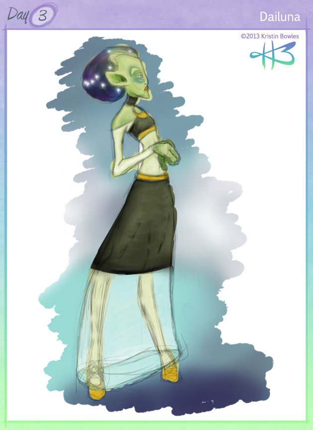
03: Dailuna
Brief Bio/Description:
Dailuna is a member of the cosmic council. She presides over the white dwarf maintenance department, and takes her job very seriously. She’s also one of the leading fashion trend-setters in her galaxy. Her “hair” is actually a cerebral-nervous window, which mimics the appearance of a galaxy. The more relaxed she is, the fewer the number of white star bursts and the calmer the changing of the colors. When she is agitated, the bursts are rapid and the colors swirl. She paints her lips and hooves and sometimes applies cosmetics around her eyes and on her facial skeletal pieces.
Style Commentary:
Dailuna is almost the lofty cosmic being I’ve had stuck in my head for three days now. Almost, but not quite. Again, I had a great deal of fun with the pencil-sketch brushes, and used about five layers in Photoshop to slap down a goofy background and basic colors on her. I wanted to do more with clothing today, so I played around and took a little extra time painting in the different areas and used a clipping mask or two to help keep her figure separate from the background. Honestly, the most impressive stylistic revelation, to me, is that I am exponentially faster at laying down and finishing rough colors now than I was even a few months ago. I love it!
02: Oretta
Character Name:Â
Oretta
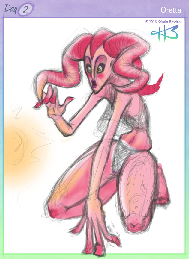
Brief Bio/Description:
Oretta is an obnoxiously curious member of her family, and is well known in her tribe both for getting into terrible trouble, and making wonderful discoveries. She is best friends with the tribe chief’s children, despite being considerably older than them. She hates to be idle and has an insatiable craving to move and discover and try new things. Many of her tribes’ men and women admire her, but are sure to let her know about her short-comings. Having a large ego is frowned upon in her culture. Even still, the efforts everyone seems to make to keep Oretta from getting too big an opinion of herself also serve to make Oretta feel more like a burden than a blessing. At the core of her excitable, happy, and restless personality is a dark sprout of inadequacy and insecurity.
Style Commentary:
I started Oretta with a slightly different alien female in mind. I wanted a slight, androgynous frame and a body comprised primarily of straight lines and very slight curves. Oretta began like that, but as I hashed out her legs, I felt the need to make her more muscular and earthy. I was also excited to rediscover some incredible pencil-like brushes I’d purchased in Photoshop, and went to town with the sketchy quality it let me build on my digital canvas. I almost left her as just a sketch, but I really wanted to add a splash of color to her. So I blocked in her body shape, slapped on a clipping mask, and used some selective soft-edge, pressure-sensitive opaque darks and lights and reflective gold to throw some extra life into her. I’m really excited with how she turned out.
01: Sonho
Character Name:Â
Sonho
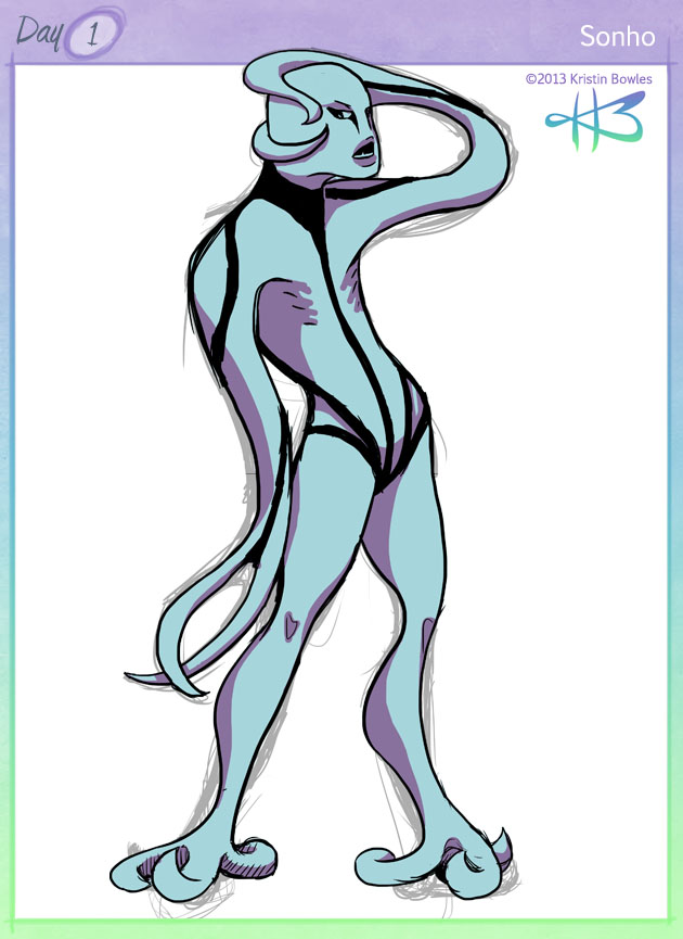
Brief Bio/Description:
Sonho is a gender-less but male-identifying amorphous, amphibious being. His appendages, and the majority of his body, are comprised almost exclusively of muscular tissue. Lacking a proper skeleton, his body contains flexible cartilage which can be manipulated into different shapes and locations with enough muscular control. Sonho prefers to keep the majority of his cartilage in his head and torso. You could compare his abilities to a cross between those of a jelly fish and an octopus. He finds humans fascinating and loves human humor and sarcasm. He stumbled onto the website known as 4chan, and now he makes tentacle jokes all the time. His human friends often draw comparisons between Sonho and average teenage boys, despite Sonho claiming to have lived over a century already. He loves to eat sushi; not for the taste, but for the irony and reactions he gets.
Style Commentary:
In the past, I’ve had a very difficult time bogging myself down in the details. I resolved today to sit down, rough out a decent pose, and lay the character out with simple details. I’m determined to avoid plain human characters (though I may “cop out” and do a few at some point this month, if the whim strikes) so I can start broadening my skills and get some new research done. Like, for this guy! I wanted Sonho to be technically genderless, and when the tentacle appendages started happening, I wanted to keep in mind some semblance of a factual basis, so I looked up the muscular system of an octopus! Very cool! Back to technical style: I laid down a simple black outline over the pose sketch, then filled a base color, which I copied and changed to the shadow color so I could mask it away for a simple cell-shaded effect. Not my usual approach, but I had fun and didn’t bury myself in immense detail or color work, so: mission accomplished!
2013 Challenger: Kristin Bowles
Here we go! This will be my third time attempting the 30CC! The first time around, I was far too busy and didn’t make a single post. Last year, I got about 30% complete. This year I’m hoping to pump up the achievement level and do the challenge in full!
Previous years’ intro posts: 2011 | 2012
So, what have I don’t since my last attempt? Here are the highlights:
 Â
  Â
 
 Â
 
 Â
 
 I guess I can summarize them by saying I’m getting slowly more comfortable with digital art while still enjoying pencil and pen – good old-fashioned drawing and sketching.
I’m trying to break away from my comfort zones this time around – I’ve been trying to experiment with more fantasy characters, especially anthropomorphic ones. So, hopefully this time around I’ll be producing a good variety of traditional and digital works that aren’t all pretty humans!
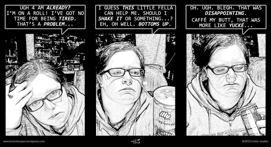
In closing, here’s a goofy comic I slapped together earlier this year, featuring none other than myself.
09: Ubskyura
Character Name:Â
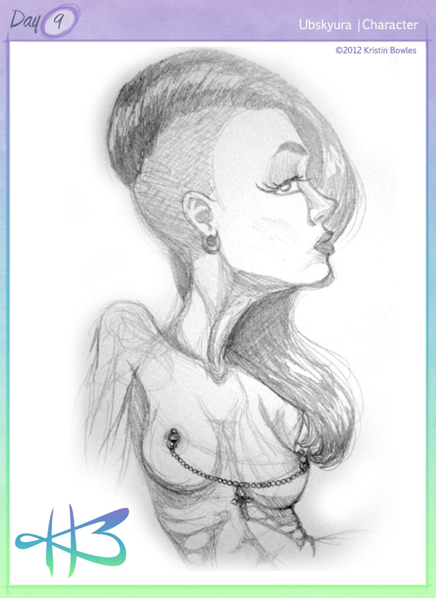
Ubskyura
Brief Bio/Description:
Ubskyura: self-named fetish model and body artist. She has a history with several circuses, freak shows, and adult entertainment businesses. She doesn’t like speaking. She prefers people to know her based on what they see, how she moves, and what actions she takes. She tends to be a loner, but settles in to small groups easily, often letting her quiet, obscure mystique transform her into the center of attention. She does not believe in romance, exclusivity, monogamy, or virtually any other Christian-founded orthodox construct. Her reason for living is finding new ways to change, improve, and enjoy herself. This includes, but is not limited to: body modifications, piercings, plastic surgeries, orgies, and more alternative lifestyles than any single textbook lists.
Style Commentary:
Ubskyura was influenced, in part, by two amazing people I know. One, Skye Kearney (aka, Infamous Insomniac and Silver Coils) is an amazingly beautiful, versatile, non-conforming ball of awesome. She ignores standards and labels and does what she wants. Both her artwork and her modeling career have been tremendously inspirational to me, and I cannot express how lucky I count myself for getting to know her in person. The second, Ms. Azreal Robles (aka, WooshCookie) is an explosion of wonderful independent attitude combined with a love for classy things with interesting twists. She grabs life and makes it take her where she wants to go, and I admire her immensely for that! Both of these people also happen to have pretty radical hair – which I love <3
Publishing Note:
CC2012 entries 05-09 are SUPER LATE but I wanted to get them online anyway. I did them in November, but was unable to get them online due to life’s circumstances and general busy-ness from November until now.
08: Portrait of Loss
Character Name:Â
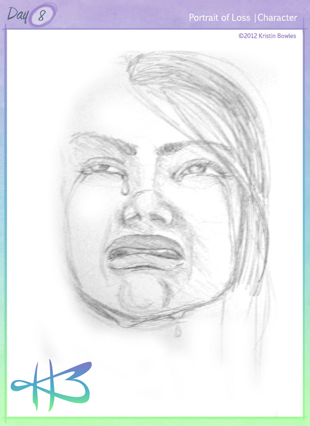
Portrait of Loss
Brief Bio/Description:
This piece is more a conceptual exploration of emotion than a particular character. The Portrait of Loss is consumed by sadness and grief, trapped in the suffering that happens after losing something or someone dear to them. Her face contorts shamelessly in emotional agony and tears run sloppily down her face, overflowing from eyes that squeeze shut and blur more often than they can hold themselves open to see. But she is honest in her pain, and pure in her heart. She mourns for what has been lost. But she must yet accept that it is not coming back, and she must steel her heart against the reminders that will exist and come back to haunt her all the rest of her life.
Style Commentary:
November was a very stressful point in my life, and I definitely let that channel into some of my work. It was a very challenging thing – trying to use your own negative emotions to create something; trying to spin such negativity into something positive. The hardest thing was facing it – literally – in the mirror. This is not a self-portrait, but I heavily referenced my own face to make this image. Again, I cannot really convey just how challenging that was. Even still, it was ultimately therapeutic; I did create, I did turn it around into this piece, and I can look back on it now and fully appreciate what it took to pull it off.
Publishing Note:
CC2012 entries 05-09 are SUPER LATE but I wanted to get them online anyway. I did them in November, but was unable to get them online due to life’s circumstances and general busy-ness from November until now.
07: WOMan
Character Name:Â
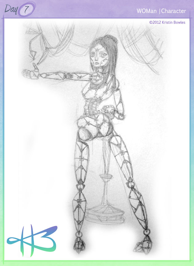
WOMan (Wireless On-board Maintenance)
Brief Bio/Description:
WOMan, or Wireless On-board Maintenance, is a humanoid computer system designed to complete repairs and general maintenance in various space, land, air, and sea vessels. WOMan comes equipped with full schematics and mechanical instructions installed, specifically for the vessel in which it will be used. WOMan also comes with a self-preservation pod, for repairs and updates to its chassis and software. This pod is also a storage space for any time when WOMan is not in use. Please consult your regional distributor for price quotes and package information.
Style Commentary:
I believe I’d gotten myself into a Ghost in the Shell kick when I started this one. I believe I’d also re-watched Hugo around that time. I wanted to create a mechanical character, one that was very obviously non-human, but still held an element of female attractiveness. I enjoy the idea of many pieces coming together to create a whole, and had a great deal of fun setting all the lines and joints and bolts in her design. It was also fun to eliminate the need for human anatomy, and focus on a more purely mechanical approach to a humanoid form. The flexible compression support that makes up her waist was definitely a move toward blatantly disregarding normal human proportions. Which is fun to do, sometimes!
Publishing Note:
CC2012 entries 05-09 are SUPER LATE but I wanted to get them online anyway. I did them in November, but was unable to get them online due to life’s circumstances and general busy-ness from November until now.
06: Theodoreo
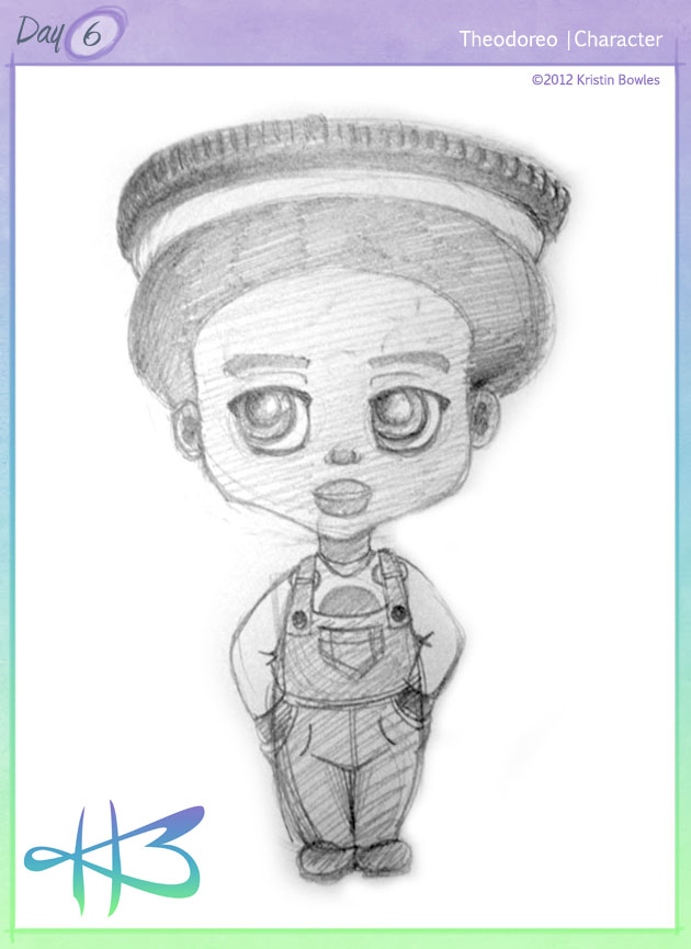
Character Name:Â
Theodoreo
Brief Bio/Description:
Theodoreo is one of the many racers in Sugar Rush. He’s soft-spoken and sweet. His favorite drink is milk and he loves making people smile. Theodoreo’s race car resembles a train engine, where the stacks and wheels are made of – you guessed it – Oreos. His color scheme is black, brown, white, and denim blue. Due to his sweet demeanor, he refused to bully Vanellope even after King Candy altered the game’s code, and retired himself from most of the games. With Sugar Rush’s reboot, he is in much higher spirits and is excited to get entered into the player roster again.
Style Commentary:
Obviously, this is an original character based on the movie Wreck-It Ralph, specifically from the game Sugar Rush. I adore that movie, and I adore Oreos, and I thought the little Oreo guards were amazing, and I got the brilliant idea to make an adorable racer that fit the Oreo theme. I didn’t use any reference, sadly (there wasn’t much available at the time) and there are huge stylistic differences between Theodoreo and the other racers, but I think I managed to capture the “wholesome, fun, boyishness” that I was going for with him!
Publishing Note:
CC2012 entries 05-09 are SUPER LATE but I wanted to get them online anyway. I did them in November, but was unable to get them online due to life’s circumstances and general busy-ness from November until now.
05: Jarel
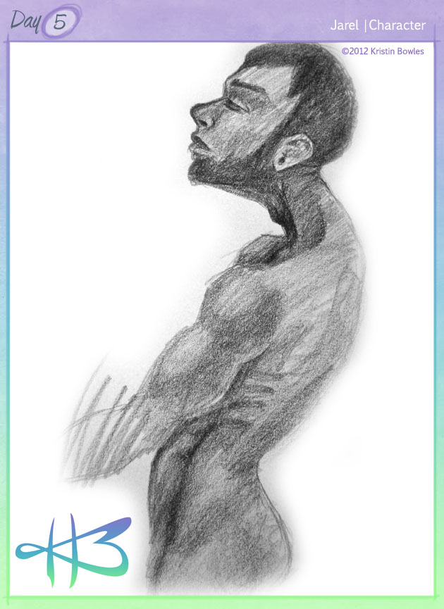
Character Name:Â
Jarel
Brief Bio/Description:
Jarel is an existential narcissist. He lives in the now and worships health and nature. He prefers to be nude than to cover up the masterpiece that is his body, and revels in the wonders that it can accomplish. He is an eccentric individual who both loves and loathes the convenience of consumerism. If he could, he would live on a private beach and spend all his days eating exotic fruits in the company of like-minded women.
Style Commentary:
Jarel began as an exploration of the male form and muscle definition practice. But I wanted to do a slightly unusual body type, a slender frame with good muscles. I was going through a tiny-neck phase, which irks me in retrospect… but, in person I love the quality of this drawing. It was good to render anatomy again.
Publishing Note:
CC2012 entries 05-09 are SUPER LATE but I wanted to get them online anyway. I did them in November, but was unable to get them online due to life’s circumstances and general busy-ness from November until now.
04: Dew Drop Dazzle
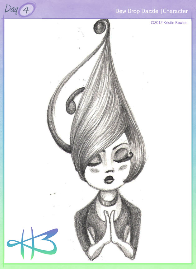
Character Name:Â
Dew Drop Dazzle
Brief Bio/Description:
Dew is a “do-good” spirit, similar to a fairy. She doesn’t have wings – which she is sometimes bitter about. But then she remembers her fabulous hair. Dew is a spirit concerned with sprinkling the morning dew on the flora, specifically around meadows and small wooded areas. She’s been known to venture into areas populated by humans, too. Her handiwork is always much-admired by the children. Dew always makes sure her little beads of water are as crystal clear and prismatic as possible – so every morning, each drop is its own little rainbow. She takes her work very seriously, but hardly ever worries over anything.
Style Commentary:
I began this drawing with several abstract shapes and curves. It was a very therapeutic exercise, just letting lines run into each other and begin the form for a character. Once I got an idea for more details, I latched on to it and made it happen. At first I didn’t want to include the bust shot – I wanted to keep it a head shot. But, despite the intention I had behind her design, she looked too much like a voodoo totem without a bit of body showing!
02: Qorah
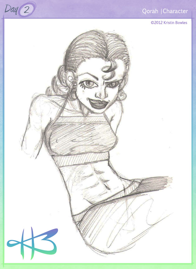
Character Name:Â
Qorah
Brief Bio/Description:
Qorah is a spunky, brash, and flirtatious girl with a passion – and talent – for boxing. She runs track and dabbles in basketball, but nothing gets her spirits higher than being in a ring with an opponent. She’s recently been showing an interest in mixed martial arts. She doesn’t know it yet, but soon she’ll be starting up an underground women’s federation. A Ladies’ Fight Club, of sorts.
Style Commentary:
I decided to stick primarily with my own style for this character, but created a personality that I usually stray from – the wild, brash type. I think I managed to capture it fairly well. I also aimed for an ethnicity outside of my comfort range, but didn’t have any set reference in mind. She comes across to me, now, as a blend of African, Hispanic, and a tiny bit Italian. Not sure where I’m getting Italian.
01: Psy-Nav
Character Name:
Psy-Nav
Brief Bio/Description:
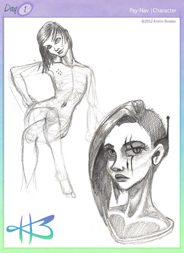
Psy-Nav is a hybrid being designed by the military to serve as a mobile navigation and control unit with combat and stealth parameters. Psy-Nav identifies as female and she has two standard avatar forms: a console-mounting head unit, and a full humanoid body for combat and stealth operations. She is very assertive and has a spunky, abrasive attitude – she blends in well with “the guys” in the units to which she is assigned.
Style Commentary:
I’m approaching this challenge as an exercise-a-day and avoiding themes and solid obligations. As such, I scribbled out Psy-Nav’s body sketch first, primarily in my own style, and got a feel for the character’s personality and decided to do a head-shot. I was inspired by oasiswinds and artchoface from tumblr – the drawing here is, in my opinion, a successful merge of the three styles.
2012 Challenger: Miss Kristin Bowles
Hello, hello, hello again!
You’re actually going to see some uploads from me this year – I swear! I’ve got oodles more time and quite a bit more motivation to lock down and take care of business this time around!
My name is Kristin Bowles
I graduated from the Art Institute of Tampa with my BFA in Game Art & Design in 2011; I have a fancy website and an official wordpress blog, as well as a deviantart account.
I haven’t been as active as I should have been with making art this past year…
For reference, here’s my intro post from 2011.
What I HAVE done this past year…
(CLICK TO SEE ‘EM BIGGER!)

 Â
 
(“Sleepy Time” Pokémon, done during Megacon 2012)

 Â
 
(Pottermore portrait; Mmm! Candy! Project; “Self-Satisfaction)
 Â
  Â
 
(Jinora: Legend of Korra Fanart; Anyu: Legend of Korra O.C.; EVE: Megamind Tumblrverse O.C.)
And, uh, here’s a picture of me?
2011 Challenger: Kristin Bowles
Hey there, people-who-are-reading-this!
I’m Kristin Bowles. I’ve got a fancy-schmancy website (www.kristinbowles.com), a fancy-schmancy blog (www.kristinkreates.wordpress.com), and a fancy-schmancy degree (BFA in Game Art & Design).
As a recent graduate from the Art Institute of Tampa, I’ve managed to network with a whole bunch of cool people, several of which showed this event to me, and at least one of which told me I’d better participate, or else.
That aside, I used to draw random characters all the time. Y’know, before I went to college, back in the days when I had time. And I’d like to get back to doing it, and having time.  And I need a huge kick in my drawing butt. So, here I am. Woo!
Tyler James instructed me to put up some pictures. So, here you go.
And here are some tiny thumbnails of some stuff that’s decent enough for me to share!
 Â
  Â
  Â
  Â
 
 Â
  Â
  Â
 
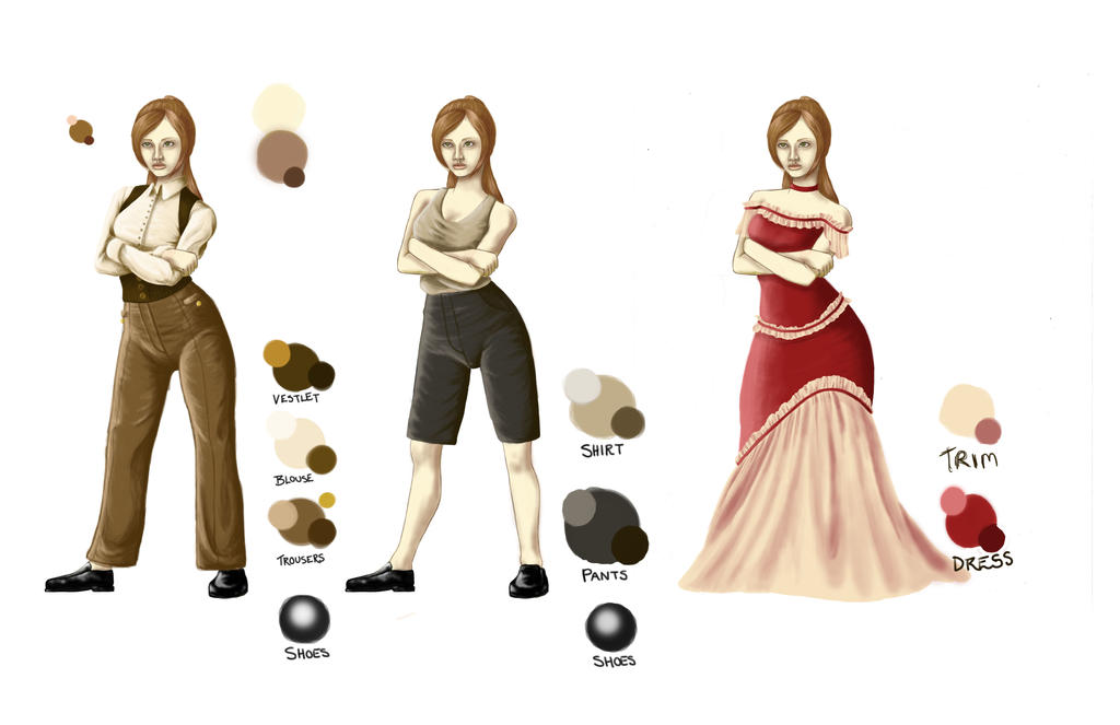
Oh, and some stuff I plan to do, or at least I’m mulling over in my brain:
- using a random word generator
- revisiting old character designs and improving them
- using a predetermined list of theme words (including months, seasons, and holidays)
- drawing more men, because all I seem to draw are ladies!








#30Characters Chatter…